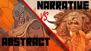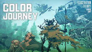
Give Your Art Impact...Understand Tonal Contrast Vs Color Contrast

Check out my Free Illustration Mini Workshop where I share my journey from Amateur to Pro: https://www.thedrawingcodex.com/illus...
You will get some simple advice on how to get more detail and polish in your work. How to think about composition. And my thoughts on how to prepare for professional work.
Let's talk about an important and often overlooked aspect of Illustration and Image Making... Tonal Contrast vs Color Contrast!
Plus how you can actually use it to avoid confusion in your process...
Below is an Automagically generated summary to help understand the video and aid search optimisation:
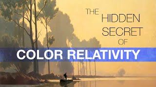
As artists, our primary task is to create striking imagery, whether it’s through comics, illustrations, or concept art. A key element in this process is creating contrast. There are several ways to introduce contrast in an image, but the difference between tonal and color contrast is particularly significant, though often misunderstood. Tonal contrast involves varying light and dark shades to distinguish different parts of an image, such as the lit and shadow sides of a form. Alternatively, color contrast uses different colors to achieve this distinction, which is evident in stylized art where shadows and highlights might be rendered in contrasting hues.
Impressionism, like Monet’s Haystacks, predominantly uses color contrast to define forms with different hues. In contrast, artists like Rembrandt employed tonal contrast to create dramatic light and dark interactions, typical of the Chiaroscuro technique from the Italian Renaissance. Understanding the application of these methods is crucial for aspiring artists and can alleviate much frustration by unlocking new ways to enhance image contrast effectively.
In this video, I’ll unpack these concepts, show examples from my work illustrating my application of these ideas, and discuss practical applications for your projects. This isn’t a quick tutorial but a detailed exploration akin to a drawing lesson, focusing on color theory and its practical uses in art. Let’s dive into Photoshop and start this journey.
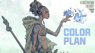
Now, let’s break down tonal versus color contrast. Starting with basics, tonal contrast, or the difference between light and dark, is foundational in art education, emphasizing that successful images should work well even in black and white. However, color can play a crucial role in contrast as well, not just supporting but central to the image's impact, as seen in the vibrant works of Sargent and the colorfocused styles of Van Gogh and Monet.
Analyzing different art movements helps clarify these concepts. For example, Rembrandt’s work, rich in tonal contrast, maintains its integrity even when stripped of color, emphasizing strong light and shadow interplay without relying heavily on color. In contrast, Van Gogh’s portraits lose much of their appeal without their characteristic vibrant colors, highlighting the importance of color in creating emotional and visual impact.
In practical terms, when planning your artwork, considering whether to emphasize tonal or color contrast can guide your decisionmaking process and influence the final outcome, whether you're capturing the mood of a moment or defining forms through light and shadow. By understanding and applying these concepts, you can enhance the depth and vibrancy of your artwork, making informed choices that reflect your artistic intentions.
In conclusion, whether you lean towards the dramatic chiaroscuro of a Rembrandt or the vivid color play of a Monet, the key is understanding the tools at your disposal. This knowledge not only allows you to enhance your artistic expression but also enables you to solve common visual problems in your art, ensuring your creations not only capture the eye but also the spirit of your subject. Stay tuned for more insights into the nuanced world of art creation here at Drawing Critics. Happy drawing!
00:00 Intro
02:51 Welcome
03:42 The Basics of Tone Vs Color
19:31 Some Examples From My Work
29:39 How You Can Apply This Concept In Your Work
40:34 Out
Happy Drawing!
Tim Mcburnie
Learn Drawing and Illustration from me: www.thedrawingcodex.com
Portfolio: www.timmcburnie.com
www.artstation.com/timmcburnie
www.instagram.com/timmcburnie
twitter.com/timmcburnie