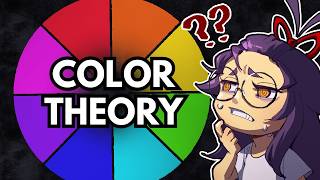
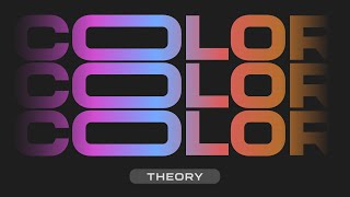
Forget Complex Color Theory... This Is All You Need!
Check out my Free Illustration Mini Workshop where I share my journey from Amateur to Pro: https://www.thedrawingcodex.com/illus...
You will get some simple advice on how to get more detail and polish in your work. How to think about composition. And my thoughts on how to prepare for professional work.
Let's talk about the way Warm and Cool Colors can be used in your art!
This video turned out way longer than I could have anticipated... So think of it more like a mini masterclass in the concept of Warm and Cool Color Theory... This concept is one of the highest level ideas in painting and art. It relates to most styles (although differently in each case). And will help you create better images.
Below is an Automagically generated summary to help understand the video and aid search optimisation: (I think it does a pretty good job of summing things up, despite sounding a bit generic)
Understanding the dynamic between warm and cool colors is crucial for elevating the impact, vibrancy, and contrast of your artwork. This concept, rooted in color theory, is simpler than it appears yet its application can profoundly transform your work. Warm and cool colors create contrast not just through hue but also saturation and brightness, affecting how colors interact and influence each other on the canvas.
The relativity of color temperature means no color exists in isolation; it's always warmer or cooler compared to another. This video demonstrates how adjusting hues, saturation, and brightness can manipulate this temperature, enhancing the overall composition of your piece. By exploring examples from my past work, I share strategies for selecting, modifying, and thinking about color in your digital art projects.
A key takeaway is the importance of setting up a warmcool contrast from the start. It’s not about adding more details or adjusting brightness and contrast settings but about fundamental color choices that define your work’s impact. I discuss practical frameworks for applying temperature concepts to art, troubleshooting common issues, and making intentional color choices that bring your art to life.
Warm colors tend to advance, making elements pop and draw attention, while cool colors recede, providing depth and background. This video explains how to harness this concept to create depth and focus in your compositions. I outline how to apply these theories in any digital art software.
Remember, the rules of art are guidelines based on what has been found to work over time. Embracing the challenge of mastering color and temperature is a step towards developing a more nuanced and expressive artistic style.
00:00:00 Intro
00:03:01 Welcome
00:03:53 What is Warm And Cool Color Theory?
00:07:51 The Basics
00:08:41 How To Pick And Mix Color In Digital Art
00:15:36 What Are Warm And Cool Colors???
00:19:47 Marker 8
00:21:04 Applying The Different Ways of Altering Temperature
00:22:43 Relativity Of Color
00:23:10 Playing With Greys
00:23:43 Temperature As A Contrast Tool
00:25:28 You Are Always Dealing With Relative Temperative!
00:26:21 Warm Cool In Composition Vs Rendering
00:27:11 Simple Strategies You Can Use
00:27:21 The Three Warm Cool Strategies
00:27:33 Warm Light Vs Cool Shadow (And Vice Versa)
00:29:12 Warm Comes Forward, Cool Will Recede
00:30:22 People Tend To Like Warm Color Schemes...
00:31:44 Do We Care Why??
00:32:03 'Science' Of Why Warm And Cool 'Works'
00:33:22 Logical Basis For Warm vs Cool Depth In A Scene
00:35:17 Logical Basis For Warm vs Cool Shadows
00:38:11 Different Ways Of Applying The Theory To Your Images
00:54:59 Example Process 1
00:58:21 Example Process 2
01:01:22 Example Process 3
01:03:55 Example Process 4
01:05:29 Example Process 5
01:07:47 Finally... How To Pick And Adjust Colors Yourself
01:08:00 Planning Warm Vs Cool images
01:09:51 Vibration Draws The Eye
01:10:14 How To Change And Pick The Right Color
01:10:24 Using Sliders And Color Wheel
01:16:09 Using Lasso Selection And Adjustment In Digital Art
01:17:10 Complex Selections Based Of Existing Color
01:19:39 Out!
Happy Drawing!
Tim Mcburnie
Learn Drawing and Illustration from me: www.thedrawingcodex.com
Portfolio: www.timmcburnie.com
www.artstation.com/timmcburnie
www.instagram.com/timmcburnie
twitter.com/timmcburnie


