This Simple Color Theory Always Works

Check out my Free Line and Color Quick Start Guide: https://www.thedrawingcodex.com/quick... You will learn how to develop a simple reliable process in photoshop. You also get all the brushes and PSDs that I use in the guide (the same ones I use for most of my illustrations).
Let's talk about some simple colour plans you can easily apply! These are ideas that have always worked for me.
Below is an Automagically generated summary to help understand the video and aid search optimisation: (I think it does a pretty good job of summing things up, despite sounding a bit generic)
Mastering color in art can be daunting, but starting with a simple color scheme is a great way to avoid frustration. In this video, I share a straightforward approach to planning and applying colors that has consistently worked for me, keeping it basic to ensure you can apply these principles in your artwork.
The essence of this method is to first identify any necessary colors based on your scene or key elements, like a character's costume or the environment's natural hues. This foundational step helps establish a logical starting point for your color scheme.
From there, choose between two basic color schemes:
Complementary Color Scheme: Select colors opposite each other on the color wheel for a vibrant yet harmonious look.
Analogous Color Scheme: Use colors next to each other on the color wheel for a more subdued, cohesive appearance.
This approach simplifies the decisionmaking process, guiding you to either amplify vibrancy or maintain harmony in your artwork. Additionally, consider whether your image truly benefits from multiple vibrant colors. Often, less is more, and a limited palette can lead to a more impactful and cohesive piece.
In practical terms, start with the dominant color of your setting or significant element and build your scheme around it. Whether opting for complementary colors for pop or analogous hues for harmony, simplicity in your color choices can lead to sophisticated outcomes.
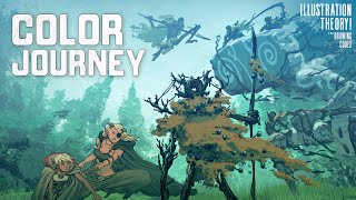
I also share some examples from my own work. And show how adhering to these simple plans—whether in a desert scene or a forest backdrop—can result in effective and appealing color compositions. It's about making informed choices that serve your artistic vision, without overcomplicating the process.
Remember, the goal is not to restrict creativity but to channel it more effectively through a wellconsidered color strategy. By focusing on what's essential and applying these basic color schemes, you can enhance your art's emotional impact and visual coherence.
Happy Drawing!
Tim Mcburnie
Learn Drawing and Illustration from me: www.thedrawingcodex.com
Portfolio: www.timmcburnie.com
www.artstation.com/timmcburnie
www.instagram.com/timmcburnie
twitter.com/timmcburnie