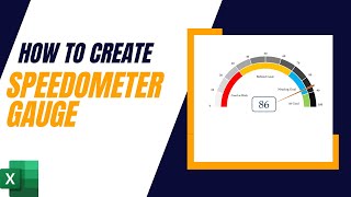
How To Build a GORGEOUS Speedometer Gauge Chart in Excel

Join the FREE COURSE TOP 30 Excel Productivity Tips: https://bit.ly/3w8yclD
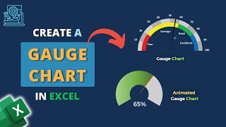
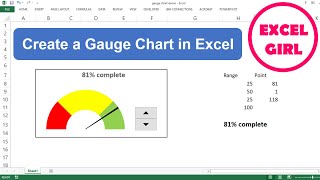
When it comes to present data in an understandable way in Excel, Speedometer (Gauge) Charts standout there. In this Excel Tutorial I'll show you to create a STUNNING Speedometer Gauge Chart.
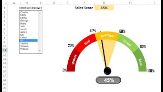
What is an Excel SPEEDOMETER Chart?
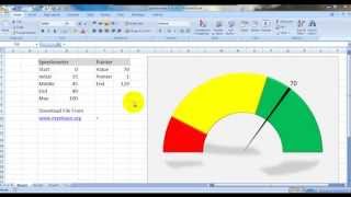
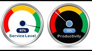
An Excel SPEEDOMETER Chart is just like a speedometer with a needle which tells you a number by pointing it out on the gauge and that needle moves when there is a change in the data. It’s a singlepoint chart which helps you to track a single data point against its target.
⬇ Grab the workbook I use in the video here: https://bit.ly/3sjTeZ9
SUBSCRIBE if you’d like more tips and tutorials like this: https://bit.ly/3HHWQME
Key Moments in This Video:
00:00 Introduction
00:37 Prepare your Data
01:20 Create the 1st Donut Chart
04:08 Create the 2nd Donut Chart
06:00 Create the 3rd Pie Chart
Join 60,000+ professionals in our courses here https://courses.mellontraining.com
LINKS to other videos:
Make An INTERACTIVE MAP CHART In Excel • How To Make From Scratch An INTERACTI...
Make An Excel PANEL CHART • Make An Excel PANEL CHART Or Matrix C...
Add Text to Numbers AUTOMATICALLY • How to Add Text to Numbers AUTOMATICA...
Sum Excel Tables in ONE STEP • Use this FUNCTION HACK to Sum Excel T...
Supercharge Your Spreadsheets with Excel's Goal Seek • Supercharge Your Spreadsheets with Ex...
Excel SUMPRODUCT Function • Excel SUMPRODUCT Function with CRITER...
2 WAYS to create Excel Bar & Donut Charts • 2 WAYS to create Excel Bar & Donut Ch...
Mastering Excel Pareto Charts • Mastering Excel Pareto Charts: A Step...
Excel Your Skills: www.mellontraining.com
SHARE this video and spread the Excel love.
Or if you’re short of time, please click the
#excelcharts #exceltutorial