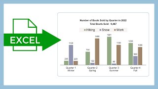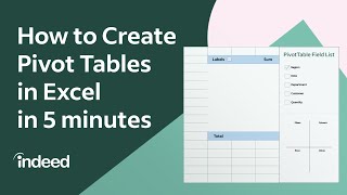
How to Create PIVOT TABLES and PIVOT CHARTS in Excel (and then format nicely!)

Here I show you how easy it is to first summarise your data in Excel with a PIVOT TABLE, then visualise the trends with a PIVOT CHART. Your pivots need not look all boring and 'Excelly' either; I show you how to format them nicely, so they don't look like pivots at all!
Never again spend hours using filters on your data to count stuff! Plus they'll be some tips along the way as usual. For example, I'll resolve the annoying question: Why does Excel keep resizing column widths when I update the pivot table??!
TIMESTAMPS
0:00 Intro
1:15 Insert simple pivot table to summarise data
2:20 Format that pivot table nicely, sort options
5:30 Duplicate a pivot table to create another one quickly
7:10 Insert pivot chart to visualise that data
7:50 Format that pivot chart nicely
See my other videos or blog with more excel tips:
https://excelattheoffice.com/blog
I hope you've found this helpful. Please like and subscribe for more handy content. I do this around a day job at at own expense (the main one being £300 per year website fees), so any contributions are most welcome you can buy me a coffee here:
https://excelattheoffice.com/buycoffee
Kind Regards,
Adrian