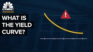
The chart that predicts recessions

A chart called the "yield curve" has predicted every US recession over the last 50 years. Now it might be predicting another one.
Subscribe to our channel! http://goo.gl/0bsAjO
Economic experts are starting to warn that a US recession is becoming more likely because of something called the "yield curve." So what's the yield curve? What does it show? And why is it bad if it "inverts?" We visualized the yield curve over the past four decades, to show why it's so good at predicting recessions, and what it actually means when the curve changes.
Read more about the yield curve:
* Vox's Matt Yglesias has an explainer: https://www.vox.com/2019/8/14/2080540...
* Here's how the man who discovered this trend, Campbell Harvey, describes the phenomenon: https://www.forbes.com/sites/carmineg...
* The New York Times explains it .... with a football analogy: https://www.nytimes.com/2019/08/15/up...
* We used data from the Federal Reserve to make these charts. Here's the yield curve data daytoday: https://www.treasury.gov/resourcecen...
* And if you really want to dig into historical data, use this tool: https://www.federalreserve.gov/datado...
Vox.com is a news website that helps you cut through the noise and understand what's really driving the events in the headlines. Check out http://www.vox.com.
Watch our full video catalog: http://goo.gl/IZONyE
Follow Vox on Facebook: http://goo.gl/U2g06o
Or Twitter: http://goo.gl/XFrZ5H