
Master Responsive Design (8 point grid system) | UI and Websites | Figma file included

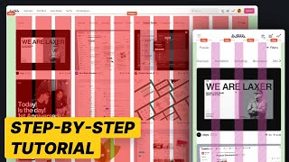
Simple guide to master designing responsive websites. Learn about breakpoints and how to set up responsive grids in Figma using the 8 point grid system. See how autolayout can help you design faster.
Sign up to my mailing list for link to Figma file: https://mailchi.mp/d2437fc71638/signup
Time stamps:
00:00 Intro
00:30 Responsive design explained
01:27 Breakpoints
05:11 Mobile or Desktop first
06:13 Grids in Figma
10:18 Design for mobile
Watch next:
8 Point Grid system: • 8 Point Grid system Improve your UI...
Improve UI Designs: • Better UI design skills | 4 rules (Im...
Choosing & Applying colours: • 8 Point Grid system Improve your UI...
UX Books:
Dont make me think: https://amzn.to/3VBi4Bj
The design of everyday things: https://amzn.to/3BdWMS
The giveaway competition is now closed, but sign up to receive updated on the next one:
Mailing list: https://mailchi.mp/ca51b817ab2a/ol6ec...
Instagram: / uxtshili
Twitter: / uxtshili
Tiktok: / uxtshili
HAVE QUESTIONS about UX/UI, tech or Figma? Add it in the comments and I will be happy to answer. You can also let me know what topics you would like me to create videos on
Some of the above are affiliate links, at no extra cost to you.


