How To Create these useful Power Bi Visuals that Excel Lacks

Join our popular FREE Power BI QuickStart course today: https://link.xelplus.com/ytdvisuals...
Dive into the world of advanced data visualization with Power BI! Our video tutorial showcases some of the most impactful visuals in Power BI, turning complex data into insightful, actionable information. Perfect for business analysts, data scientists, and anyone looking to elevate their report design skills.
Join 400,000+ professionals in our courses here https://link.xelplus.com/ytdallcou...
⭐ If you're ready to become a Power BI Pro, join our "Fast Track with Power BI" https://link.xelplus.com/ytdvisuals...
Highlights of This Tutorial:
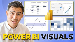
▪ Ribbon Chart: Discover how to track rank changes and data over time.
▪ Decomposition Tree: Explore this AIpowered visual for multidimensional analysis.
▪ Scatter Chart with Play Axis: Learn how to analyze changes over time with interactive scatter plots.
▪ Infographics & Custom Visuals: Get creative with custom shapes and dynamic visuals in your reports.
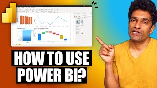
Here is a list of my favorite Microsoft Power BI visuals. I'll show you how you can turn data into actionable decisions. You'll learn about 4 powerful visuals in Microsoft Power BI. We'll start with the ribbon chart to easily identify rank changes over time. Next is the Power BI decomposition tree which lets you visualize data across multiple dimensions. It automatically aggregates data and enables drilling down into your dimensions in any order. It also has an Artificial Intelligence (AI) feature that can find insights for you. Then we'll take a look at the scatter chart in Power BI which comes with a special twist. It has a play button so you can visualize the change in the bubbles over time. And finally, I'll show you how easy it is to use infographics in Power BI to get your message across. Neither of these charts is easy to setup in Excel.
00:00 Powerful Data Visualization in Power BI
00:55 Ribbon Chart
03:17 Decomposition Tree
05:49 Scatter Chart with Play Axis
07:08 Infographics
10:17 Wrap Up
LINKS to related videos:
How to Use Microsoft Power BI: • Power BI Tutorial For Beginners | Cre...
10 Power BI Tips for Better Dashboards: • 10 Power BI Tips for Better Dashboard...
➡ Join this channel to get access to perks: / @leilagharani
☕ Get the Official XelPlus MERCH: https://xelplus.creatorspring.com/
Not sure which of my Excel courses fits best for you? Take the quiz: https://www.xelplus.com/coursequiz/
RESOURCES I recommend: https://www.xelplus.com/resources/
Let’s connect on social:
Instagram: / lgharani
LinkedIn: / xelplus
This description contains affiliate links, which means at no additional cost to you, we will receive a small commission if you make a purchase using the links. This helps support the channel and allows us to continue to make videos like this. Thank you for your support!
#powerbi